Pink pairs well with most hues, from neutrals to soft and bold ones. The color is standard in feminine and kids’ styles, but some of its hues also suit masculine rooms. Green colors complement pink since it’s a blend of red and white.

Pink Pairing with Neutral Tones
Pink pairs well with neutral tones, creating a soft, sophisticated look. Beige, gray, green, and cream are neutral colors that complement pink.
1. Pink with Beige

Beige walls provide a warm and calming backdrop for pink accents. This study by Vivid Interiors features beige and light wood pieces, adding a cozy touch to the scheme.
Because beige is a light hue with little depth, gold gives the flashiness it often needs to thrive. Accents such as table lamps, picture frames, and organizers enhance the room’s personality.
2. Pink with Dark Green

Blush pink is a soft and romantic color well-suited for bedroom spaces. It pairs with green, as seen in this modern space by Avalana. The nature-inspired wallpaper adds a tropical vibe to the interior design.
Due to the sharp contrast between both colors, the proportions play a huge role in the design’s outcome. Dark green is a suitable dominant color for large furniture pieces and blush accents.
3. Pink with Sand

Sand decor pieces and vibrant cushions inject color into this neutral space. Soft pink shades act as neutrals, complementing the sand’s warm, earthy tones. The neutral wall paint grounds the combination, creating a cohesive and timeless look.
When designing, SAND opted for different materials, including leather, jute, fabric, and stone. Brass accents also add to the contemporary feel of this space.
4. Pink with Cream

The staples in this design are neutral, from the cream carpet to the white bed frame and ceiling. Neutrals match the existing wooden floor rather than clashing with it. The designer, Lapis Ray, chose pale pink walls, which lend a soft and calming ambiance.
Pink and cream is a perfect combination for decorating with a teen vibe in mind. Since both colors are light, they make the room appear brighter and more extensive. It’s especially beneficial for small rooms that don’t receive much natural light.
Pink Pairings with Soft and Subtle Hues
A pink color palette looks delicate and feminine when combined with subtle hues. The palette is suitable for creating cozy, elegant, and inviting spaces.
5. Pink with Baby Blue
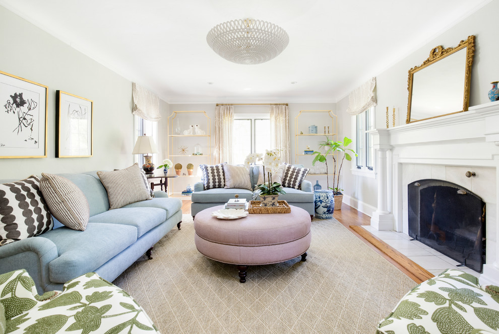
The contrast of pink and blue is often seen as fresh, trendy, and youthful. Adding the pink ottoman is an attractive focal point in this room.
It adds a burst of warm color to offset the coolness of the baby blue sofas. The black and white patterned throw pillows add another layer of visual interest. Crisp white walls balance the pink and blue, creating a well-rounded color palette.
6. Pink with Soft Yellow

Designer Annie Elliott’s golden yellow room is reminiscent of sunlight. It features a bright, cheerful ambiance that feels inviting. The bold pink sofa contrasts with the soft yellow walls.
This vibrant hue adds personality and zest, making the room lively and energetic. The deep navy blue sofa is a grounding element in this vibrant space.
It helps to balance the boldness of the pink and the warmth of the yellow with its cool, sophisticated vibe. Navy blue makes the room feel more luxurious and classic.
7. Pink with Pistachio Green

Both colors create a pleasing contrast that stands out and complements one another. The pink ottoman acting as a side table adds versatility and functionality to the room.
A gallery wall adds a personal touch and artistic touch to this space. The collection of artwork becomes the room’s focal point, enhancing the room’s visual appeal.
Pink Pairings with Vivacious and Bold Colors
Pairing pink with bold hues creates a design statement suitable for contemporary spaces. The effect depends on the specific shades and the design aesthetic.
8. Pink with Deep Purple
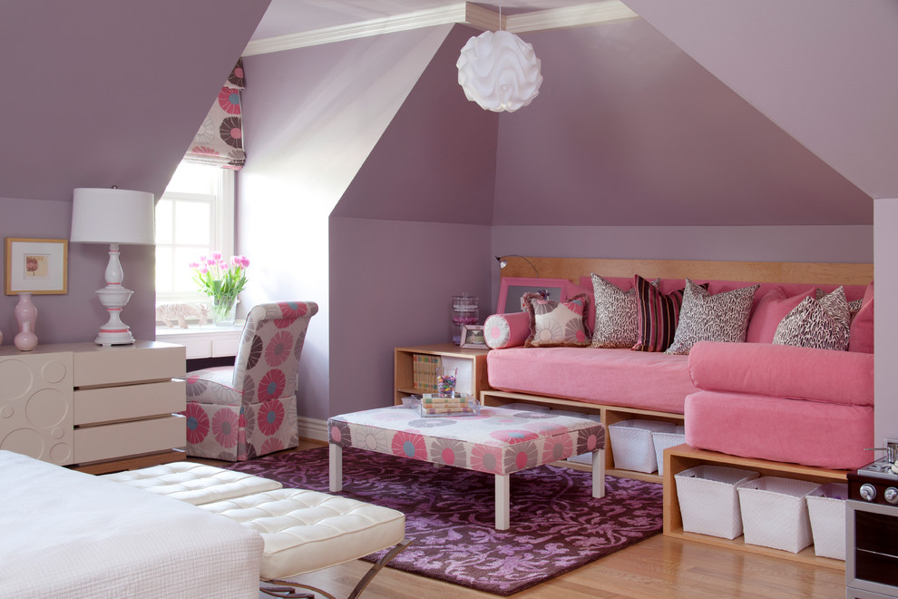
Designer Tobi Fairley used Sherwin Williams Chaise Mauve as the room’s base color. The muted purple-pinkish hue complements the deep purple carpet. The main furniture ( bed, storage bins, chest of drawers) is white.
This neutral color breaks up pink and purple, providing a calm counterbalance. Floral patterns of white, pink, and deep purple tie the pink palette together. A glimpse of natural light brings out the best in these colors.
9. Pink with Vibrant Teal

Since teal is complementary to pink, the combination stands out and draws attention to the design. Jo at Cloud Nine Interiors added a pink accent chair which pops against the vibrant teal-patterned wallpaper.The contrast is energetic, yet the two colors complement each other with warmth and vibrancy.
House plants enhance the fresh and vivid vibe. They harmonize with the teal wallpaper, adding depth to the color scheme. The plants also inject a natural element that balances the intense colors. Gold accents are a great addition if you fancy metallics in your home.
10. Pink with Ruby Red

While less intense than ruby red, pink still makes a strong statement. The large pink faux leather ottoman adds a playful twist to this eclectic living room. It complements the red sofas and provides an interesting contrast.
As an extra sitting area, the ottoman also enhances the room’s functionality. Christina Haire added a vintage chest of drawers to add character to the room. It brings warmth and a natural texture that contrasts with the palette.
Pink Pairings with Metallic Tones
Blending soft pink hues with the shimmer and shine of metallics adds elegance to any space. Introduce metallic accents through lighting fixtures, decorative objects, or wallpaper.
11. Pink with Rose Gold

This color combination fits well with the traditional theme of Anita Clark’s design. The coral pink paint color sets a lively and vibrant backdrop for the room. It’s bright but not overpowering, evoking a sense of freshness and warmth. Coral is also soothing to the eye, embodying the coastal vibe.
Rose gold, with its delicate pinkish hue, adds a touch of luxury and sophistication to the room. The accessories sparkle against the coral-pink backdrop, drawing the eye and adding a layer of elegance.

